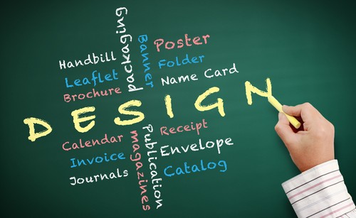
It’s true we live in a digital, online 24/7 age. But that fact hasn’t stopped the flow of printed marketing material from flooding mailboxes and desks and coffee tables. As the sea of brochures and business cards continues to stream through peoples’ lives, how do you ensure your print collateral is actually being read rather than being tossed in the recycling bin without a second glance?
Consider these tips for creating stand out print collateral.
1.Keep it simple and succinct. Each piece—business card, brochure, flier—should have a distinct purpose, and that purpose should dictate the engaging included content.
2.Embrace white space. Not only does a wall of text look intimidating (and often boring) to readers, the eye doesn’t know where to focus if there’s no empty space. Plan accordingly to take advantage of “white space” appeal.
3.Go for graphics and photos. Charts, graphs, and even better infographics, grab attention and communicate large amounts of information in an eye-catching way. Photos are a must for creating a remember-able consumer experience. Spring for professional photography or at the very least, take and use your own photos rather than stock photos that will w
eaken the authenticity of your print collateral and lend nothing toward your brand.
4.Choose the paper carefully. Whenever possible, go for the “feel factor” by using textured, recycled or glossy paper, vellum or even fabric. Also, colored paper with contrasting print is sure to grab attention in a stack of plain white mail.
5.Coordinate your online presence with all printed materials. In addition to coordinating the logo, font, and color scheme, include social media handles and QR codes to encourage readers to seek out your online presence. Consistent branding across all marketing ventures is one of the best ways to garner the “repeat exposure” needed to be remembered in the sea of information screaming for the consumers’ attention.
Don’t –
1.…try to cram every tidbit of information into every piece of marketing material. Remember, more is less. Crowded, text-heavy pieces are more likely to be chucked than read. Even a business card can be so full of information that it gets set aside without a second thought.
2.…go overboard with gimmicks. Crazy and wacky may be memorable, but no one wants to be remembered because the end result was so gimmicky that it a. buried or overshadowed the message or b. left the reader scratching his/her head in confusion.
3.…forget that all print collateral needs to be legible to be effective. This may seem like a no-brainer yet we’ve all experienced a piece of print advertising that was difficult if not impossible to read. Font choice, text size and placement all factor into readability.
Contact ASJ Partners about creating a print collateral package that coordinates with your website and social media presence. We specialize in this type of “bundle” strategy to increase brand awareness and connect your firm with new clients.


